Liminal Beings Solo Exhibition
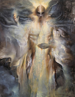
Sharing a few of my paintings here from my recent solo exhibition, "Liminal Beings". This exhibition was in November 2021 at Copro Gallery, Santa Monica, CA. Unfurling Hollow, oil on panel, 12x16" ( sold ) Nectar Spirits, oil on panel, 12x16" ( sold ) Blue Pill, oil on panel, 14x11" ( sold ) Phantasm, oil on panel, 16x12" ( sold ) Bonded Nomads, oil on yupo/panel, 12x9" ( sold ) Conjure, oil on panel, 14x11" Harbinger Foam, oil on panel, 12x9" Sails, oil on panel, 11x14" ( sold ) Exhibition Statement: Liminal beings are those that cannot easily be placed into a single category of existence. Associated with the threshold state of liminality, they represent and highlight the semi-autonomous boundaries of the social world. These new works were spawned in recent times during the lockdowns that started in 2020. These Liminal Beings are depictions of conglomerations of emotional responses to these times, when often it’s been difficult to pro